

OSO:DEN
(Case study)
Crafting the Identity of OSO:DEN
Nectar Café partnered with Magnetiq to redefine its brand and boost local engagement. Through a refined visual identity, a stronger social presence, and targeted marketing campaigns, the café evolved from a neighborhood favorite to a recognizable local brand with measurable growth.
Industry
MUSIC & EVENTS LABEL
Timeline
1 MONTH
Client
OSO:DEN
Services
Brand Identity
artwork
ILLUSTRATION
print design
(The challenge)
OSO:DEN is an underground music event label based in London, founded by renowned DJ Bear Winder. The vision for the brand was to create something that felt playful, expressive and full of personality, while still maintaining credibility within the underground music scene.
The identity needed to reflect the energy and character behind the events while also building a recognisable visual world that could grow alongside the brand.
Some of the key challenges included:
- Translating the concept of the brand visually
The brand concept centred around a “bear’s den” theme, referencing both the founder’s name and the idea of a hidden underground space. The challenge was to communicate this concept visually without making it feel overly literal or gimmicky. - Incorporating cave-inspired elements subtly
Elements such as cave textures and the idea of a den needed to influence the design in a way that felt natural and atmospheric, rather than heavily detailed or illustrative. - Balancing playfulness with underground credibility
The identity needed to feel quirky and expressive while still fitting comfortably within London’s underground music culture. - Creating a recognisable visual system for events
The brand needed to be adaptable enough to work across event artwork, posters, digital promotion and future merchandise. - Developing a unique aesthetic in a crowded scene
Many music event brands rely on similar typographic styles and minimal graphics. The goal was to create something with a distinctive personality that would stand out visually.
(The solution)
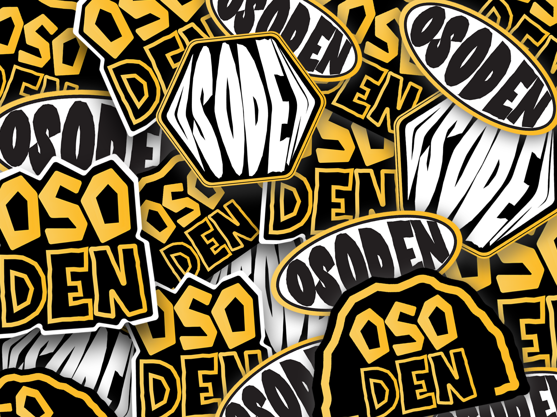
Rather than designing a conventional event brand, we developed a visual world inspired by the concept of a bear’s den - combining illustration, texture and custom typography to create something distinctive and memorable.
Brand Strategy & Identity
Our approach focused on building a playful and character-driven brand identity that reflected both the personality of the founder and the immersive atmosphere of the events.
The OSO:DEN brand identity was built around a series of visual elements inspired by the idea of a hidden den or underground space.
Key elements of the identity included:
- A full logo suite, allowing the brand to be used flexibly across different formats and applications.
- Custom typography, designed to give the brand a playful and unique visual voice.
- Illustrative elements, helping bring character and personality into the brand.
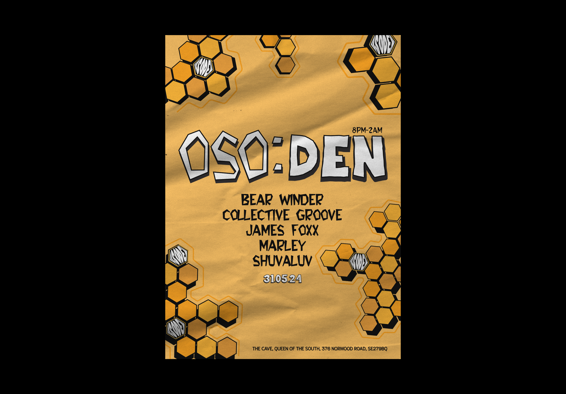
- A distinctive colour palette, influenced by natural tones associated with caves, honey and earthier textures.
- Honeycomb patterns and organic textures, used as supporting graphic elements to reinforce the brand concept.
Together, these elements created a visual identity that feels rich, expressive and instantly recognisable.
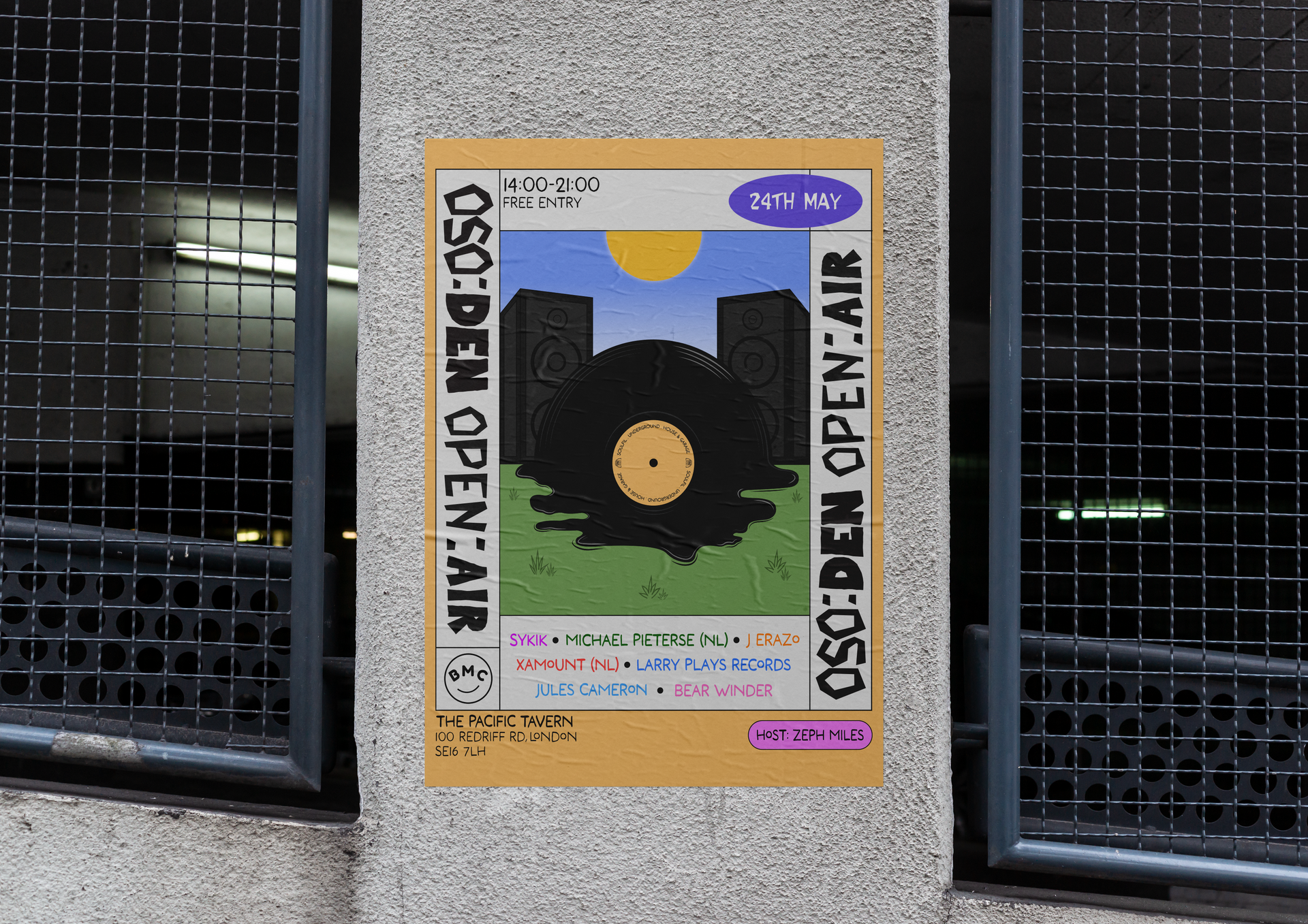
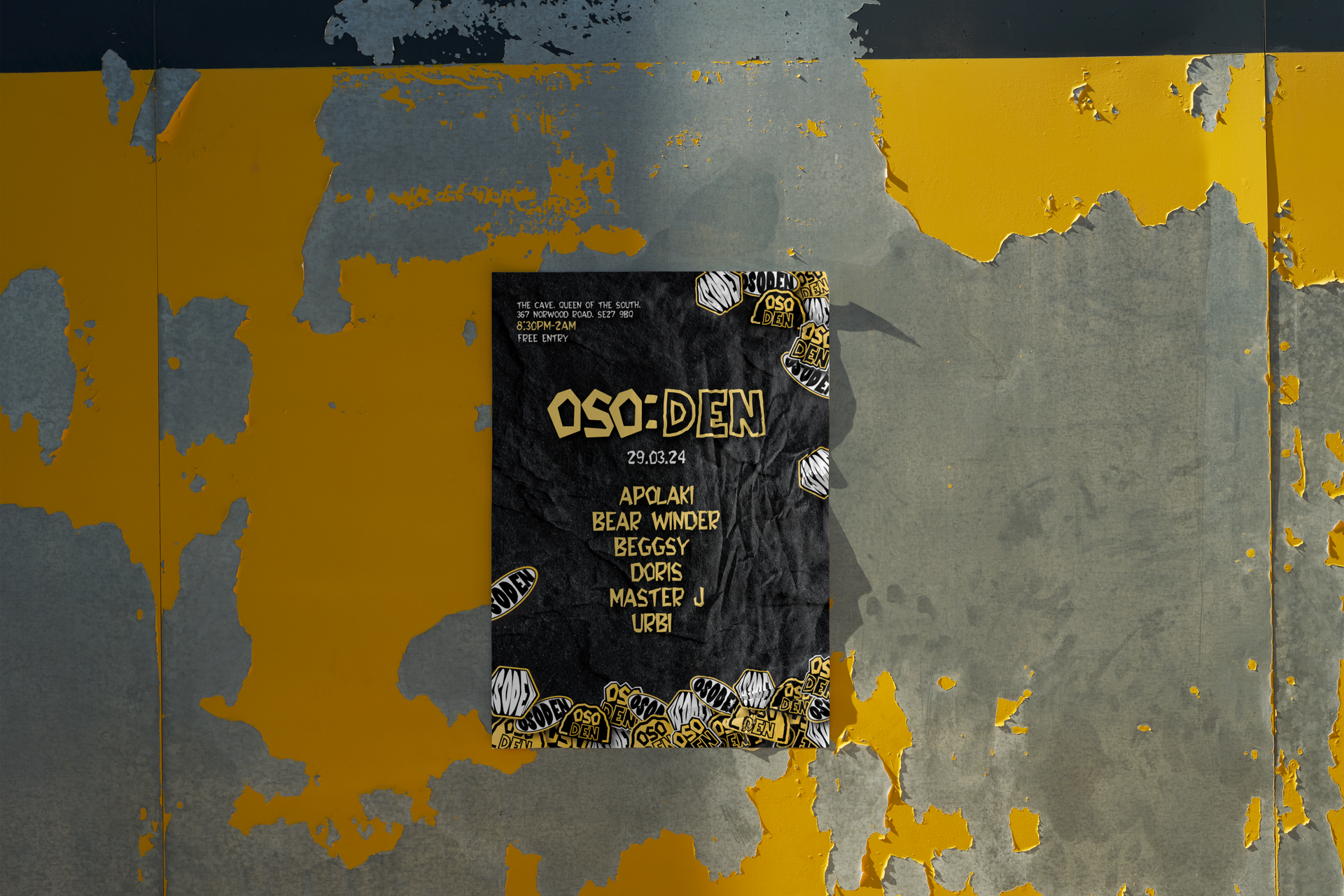
Creative Design & Collateral
The visual identity was designed to translate seamlessly into promotional materials used for OSO:DEN’s events.
This included creating artwork and visual assets that could be used across digital promotion, event posters and social media content. The flexible identity system allows each event to have its own creative direction while still remaining clearly connected to the overarching brand.
The illustrative elements, textures and patterns provide a toolkit that can be adapted and expanded as the event series continues to grow.
ready to take your brand to the next level?
BOOK A FREE DISCOVERY CALL
Schedule your session using the calendar below. You’ll receive a confirmation email with all the details and a reminder 24 hours before your appointment.