

SLICK
(Case study)
Crafting a Playful Yet Underground Identity for Slick
Nectar Café partnered with Magnetiq to redefine its brand and boost local engagement. Through a refined visual identity, a stronger social presence, and targeted marketing campaigns, the café evolved from a neighborhood favorite to a recognizable local brand with measurable growth.
Industry
MUSIC & EVENTS LABEL
Timeline
1 MONTH
Client
SLICK RECORDS
Services
Brand Identity
artwork
ILLUSTRATION
print design
(The challenge)
Slick is a house music brand rooted in underground culture and events. From the beginning, the goal was to create a visual identity that felt distinctive, memorable and instantly recognisable within the electronic music space.
The brand wanted something that stood apart from the more minimal and often interchangeable aesthetics commonly seen across DJ and event brands, while still maintaining an authentic underground edge.
Some of the key challenges included:
- Creating a brand that stands out
The house music scene is saturated with similar visual styles, often relying on minimal typography and monochrome palettes. The challenge was to develop a brand that felt unique while still being credible within the scene. - Balancing playfulness with underground credibility
Introducing cartoon-style illustration and mascots into a music brand required careful design to ensure the brand remained cool, authentic and aligned with underground culture. - Developing a recognisable visual identity
The brand needed a strong and consistent visual language that could be applied across event artwork, merchandise and promotional materials. - Designing something adaptable for events and merchandise
The identity needed to work across multiple formats including posters, social media graphics, stickers and physical merchandise. - Creating a brand that could evolve alongside the events
As Slick continued to host events and grow its audience, the visual identity needed to remain flexible enough to support different themes and artwork over time.
(The solution)
Our approach focused on building a bold and character-led identity that could give Slick a distinctive personality within the house music scene.
Brand Strategy & Identity
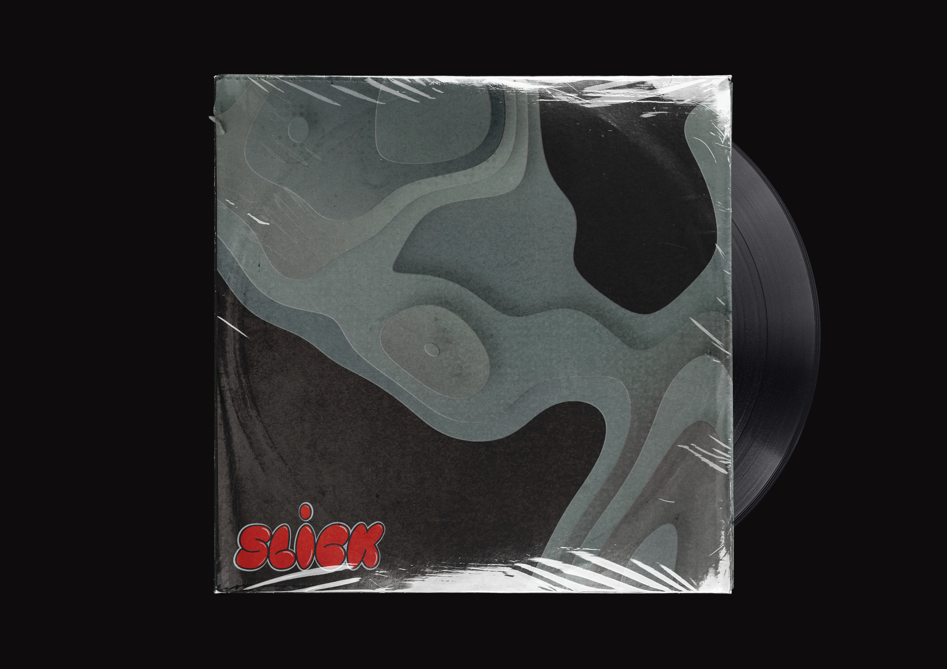
Rather than relying solely on typography or minimal design, we introduced playful illustration and custom lettering to create a brand that felt expressive, energetic and instantly recognisable. The goal was to create something that could live not only as a logo, but as a wider visual world that could be expanded across event artwork and merchandise.
Key elements of the identity included:
- A full logo suite, including a primary logo, secondary logo and supporting marks for flexible use across different formats.
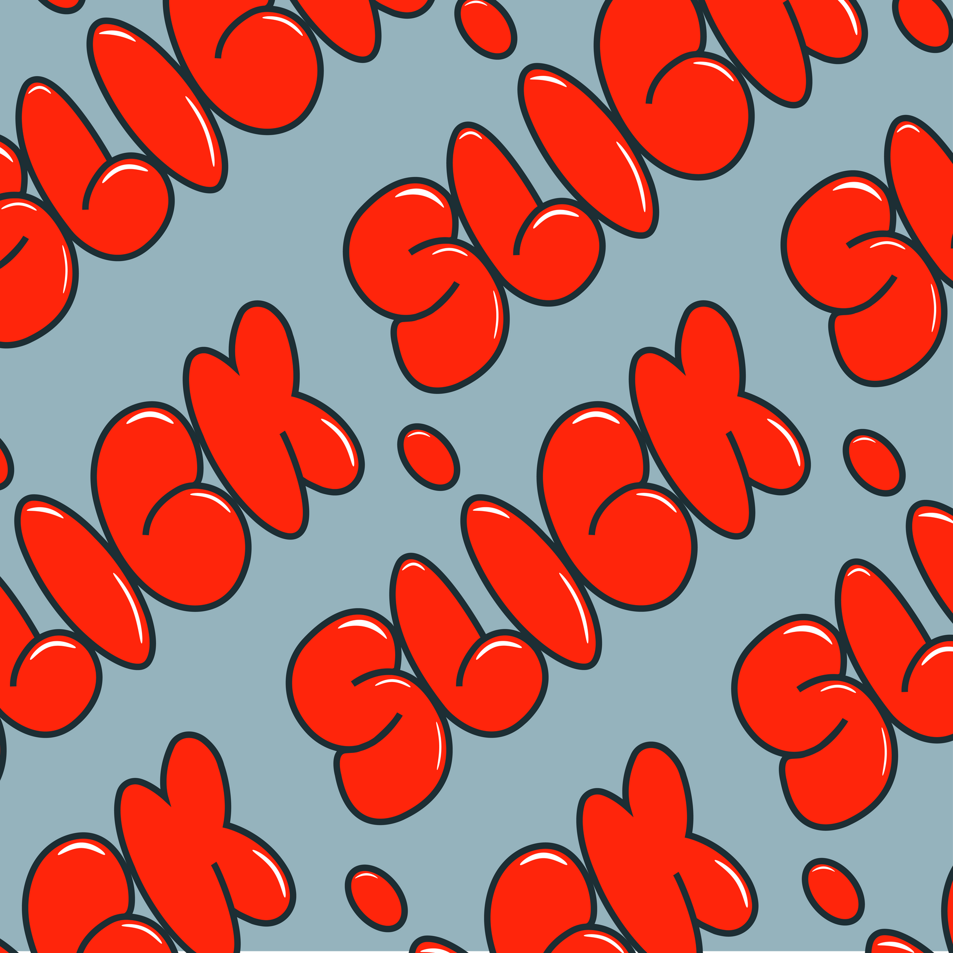
- A custom typeface, designed specifically for the brand using a playful bubble-style lettering that reflects the fun and expressive energy of the brand.
- A vibrant colour palette, helping the brand stand out visually across digital platforms, posters and merchandise.
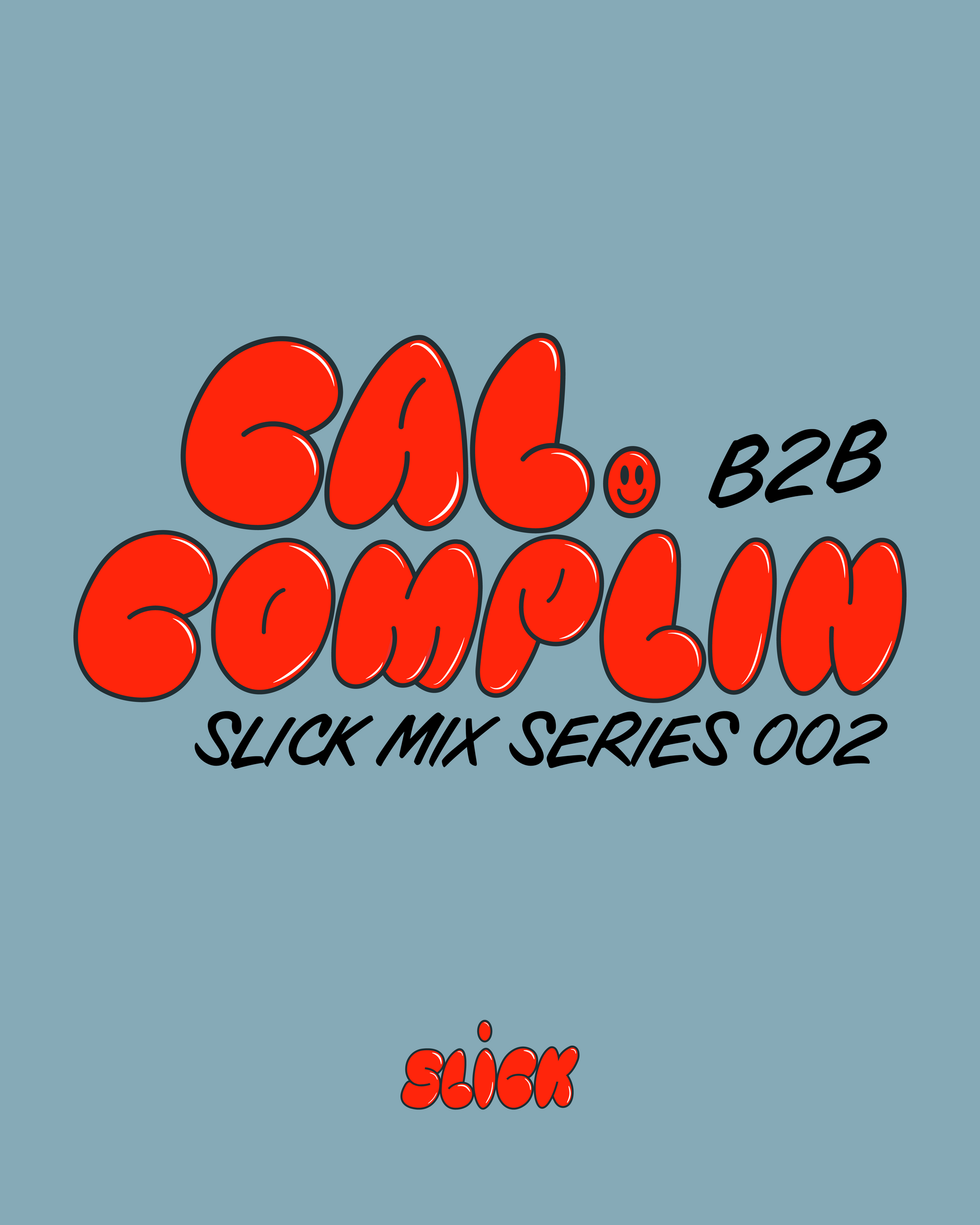
- Font pairing, ensuring a balance between the expressive logo typography and more functional type for supporting information.
- A key feature of the identity was the introduction of cartoon mascot illustrations, designed to give the brand its own unique characters and visual personality. These mascots help bring the brand to life and create recognisable elements that can appear across different artworks and materials.
Creative Design & Collateral
Alongside the core brand identity, we created a range of creative assets that could be used across Slick’s events and promotional materials.
Over the years, this has included designing event artwork and promotional graphics that align with the brand’s distinctive style while allowing room for creative variation.
Print materials and merchandise designs included:
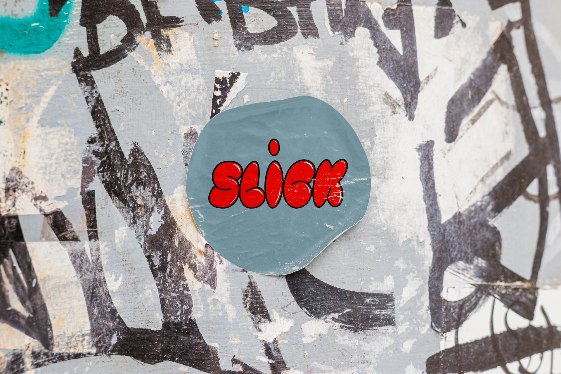
- Custom turntable slipmats
- Sticker designs
- Event signage and printed artwork
-
These pieces help extend the brand beyond digital promotion and into the physical spaces where Slick’s events take place, reinforcing the identity within club environments and amongst the community.
Creative Design & Collateral
Creative direction played a key role in maintaining consistency across Slick’s visual output as the brand evolved.
By establishing a clear visual language centred around illustration, bold colour and playful typography, the brand now has a flexible design system that can be applied across future events, merchandise and promotional materials.
This approach allows Slick to maintain its distinctive identity while continuing to experiment creatively with new artwork and event concepts.
ready to take your brand to the next level?
BOOK A FREE DISCOVERY CALL
Schedule your session using the calendar below. You’ll receive a confirmation email with all the details and a reminder 24 hours before your appointment.